Restoring a legendary brand’s classic identity.
Role
Workshop Facilitation
Art Direction
UI Design
Team
Meagan Petri, Creative Director
TJ Sanders, UX Designer
And others at Mindgrub
Background
In 2020 Livestrong adopted an unpopular rebrand that moved away from their famous black and yellow identity. Originally this website redesign was meant to reintroduce the 2020 rebrand to the public, but just as design was nearing completion, Livestrong announced they would be reverting to a refreshed version of their classic brand. With only a partially completed brandguide to guide us, we restarted the project from step one and helped Livestrong define how their new/old brand would translate to the web.
Dynamic scroll animations.
Custom interactive map.
🛠️ Process
01 Research, reports, and workshops.
Workshops are more about facilitating a conversation than rigid results. By leading the Livestrong team through 10 different personality sliders and 20 design examples I learned their team dynamics, where they disagree, and where we all align.
02 Style Tiles to refine visual direction.
Livestrong was still figuring out their brand and how to use their newly appointed tertiary palette. The style tiles were the ideal playground for iteration and definition before approaching the high fidelity template designs.
03 Design system and modular layouts.
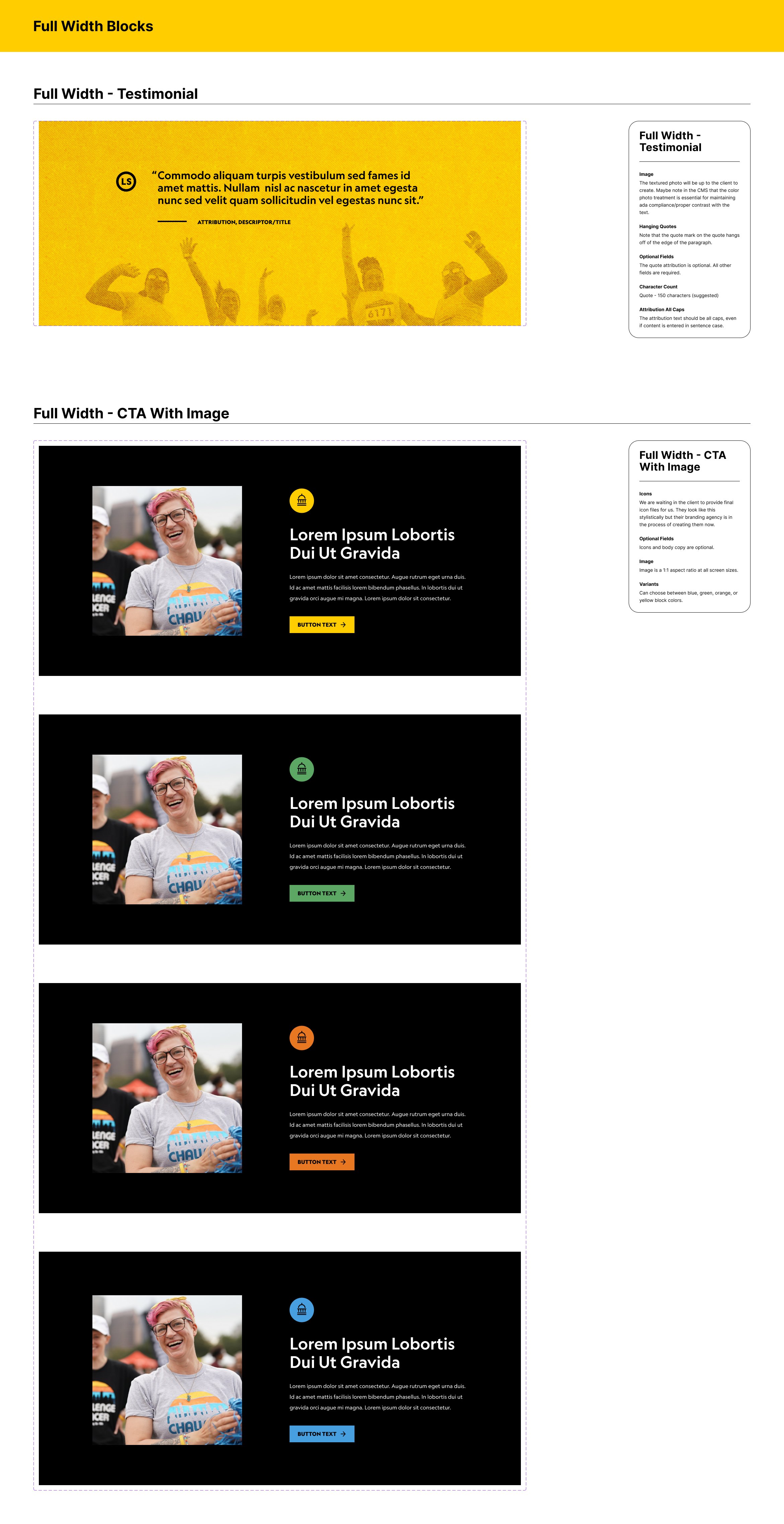
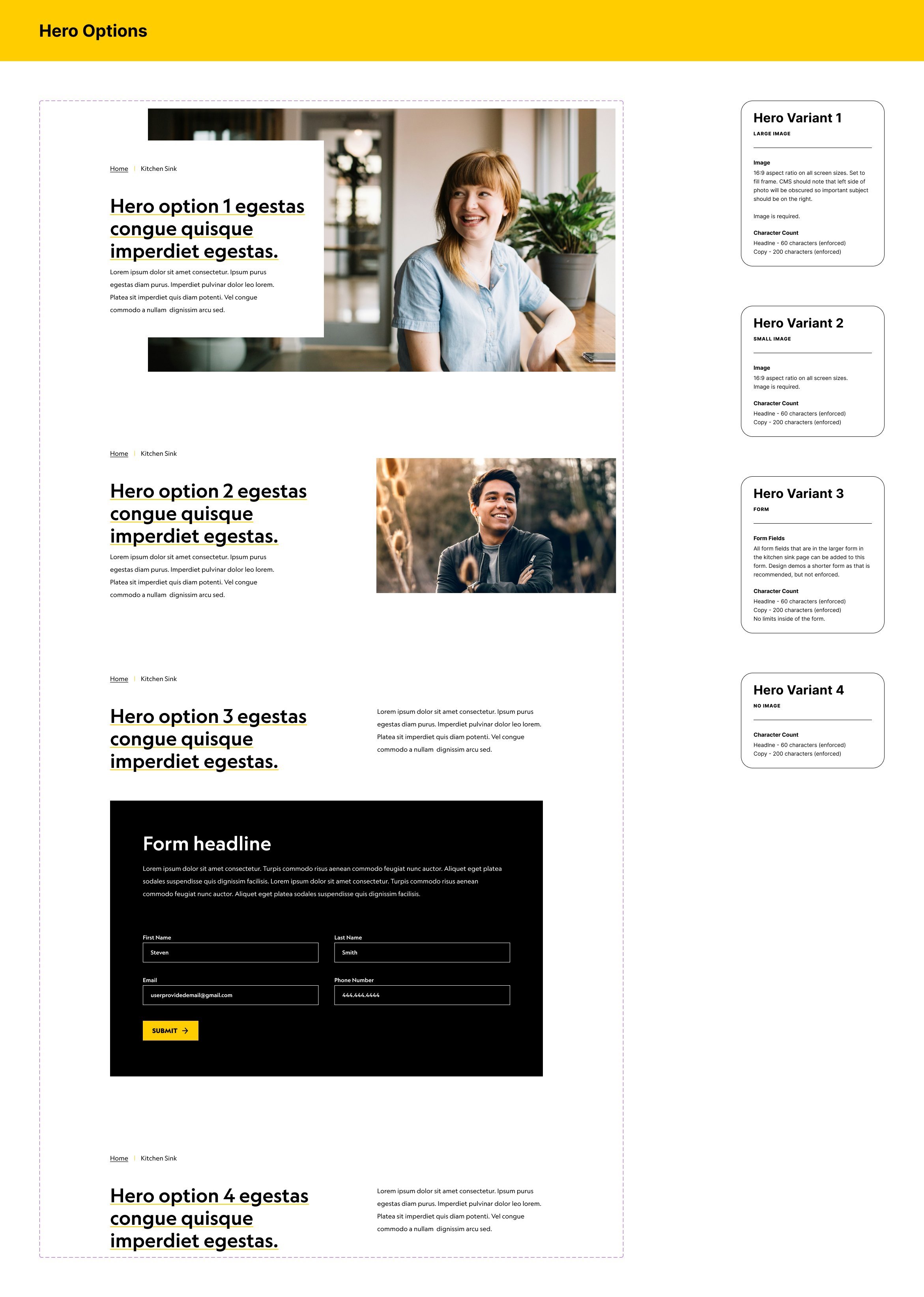
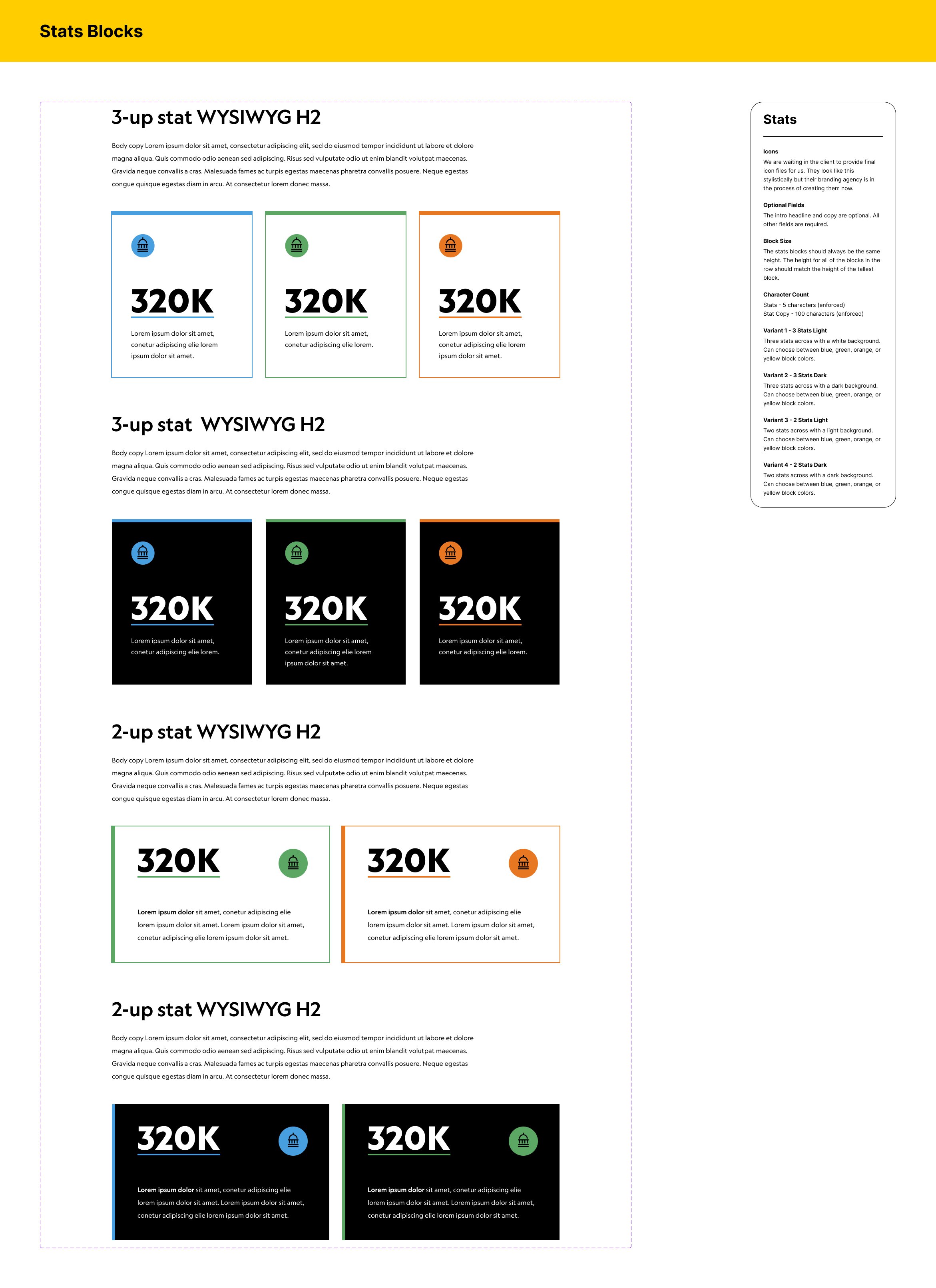
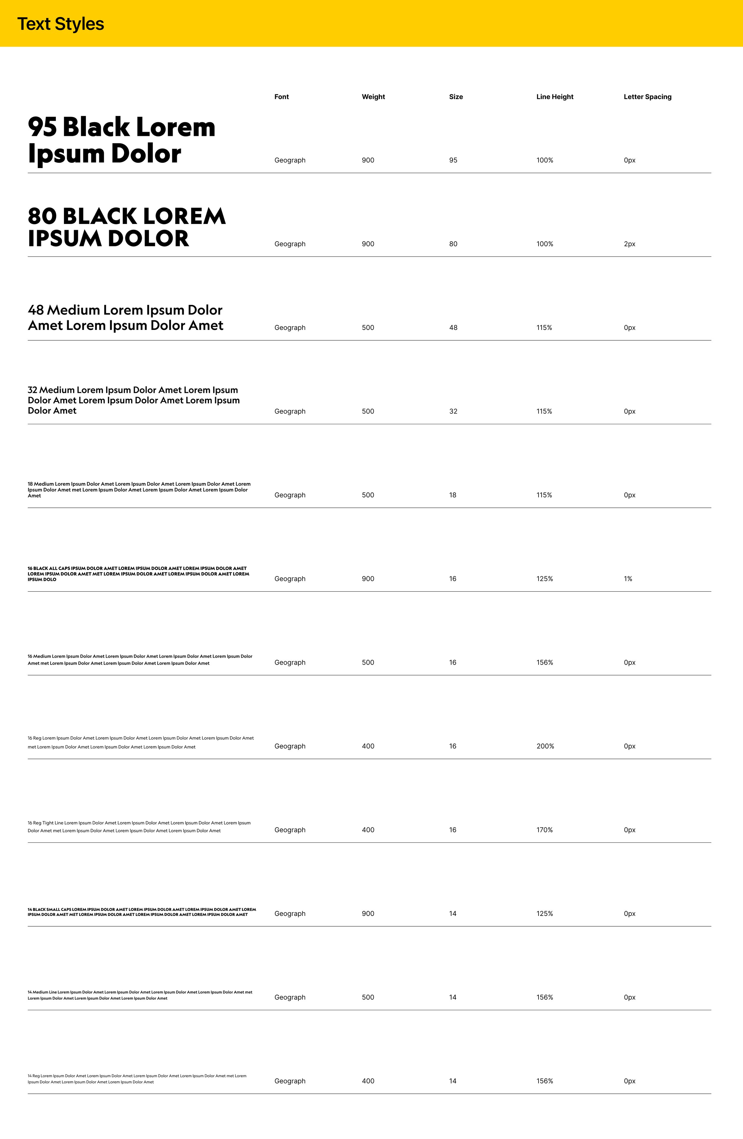
I provided developers with files built on a well structured design system complete with annotations describing interactions, hover states, character counts, and responsive behavior.


