Role
Content Strategy
Art Direction
Print Design
Team
Created while working as a Senior Designer at Mission
Background
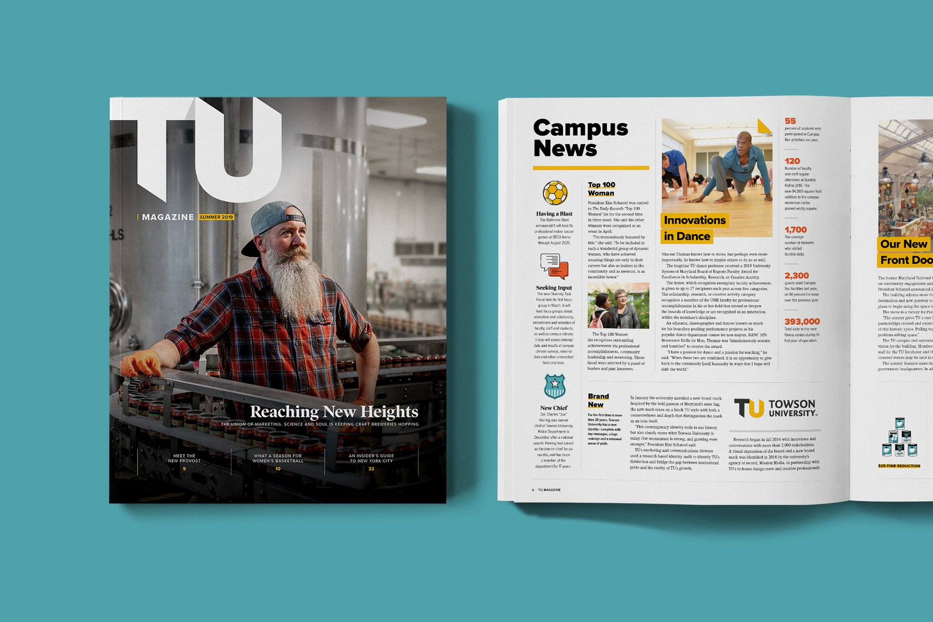
This project was a complete overhaul of both content and design of Towson University’s alumni magazine. The resulting publication was a huge success garnering praise from TU students, faculty, and alumni.
01 A template for TU’s internal team.
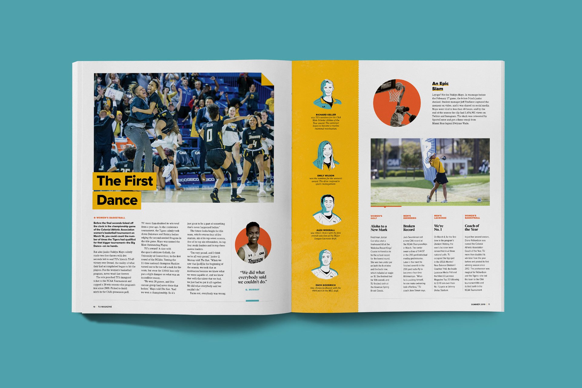
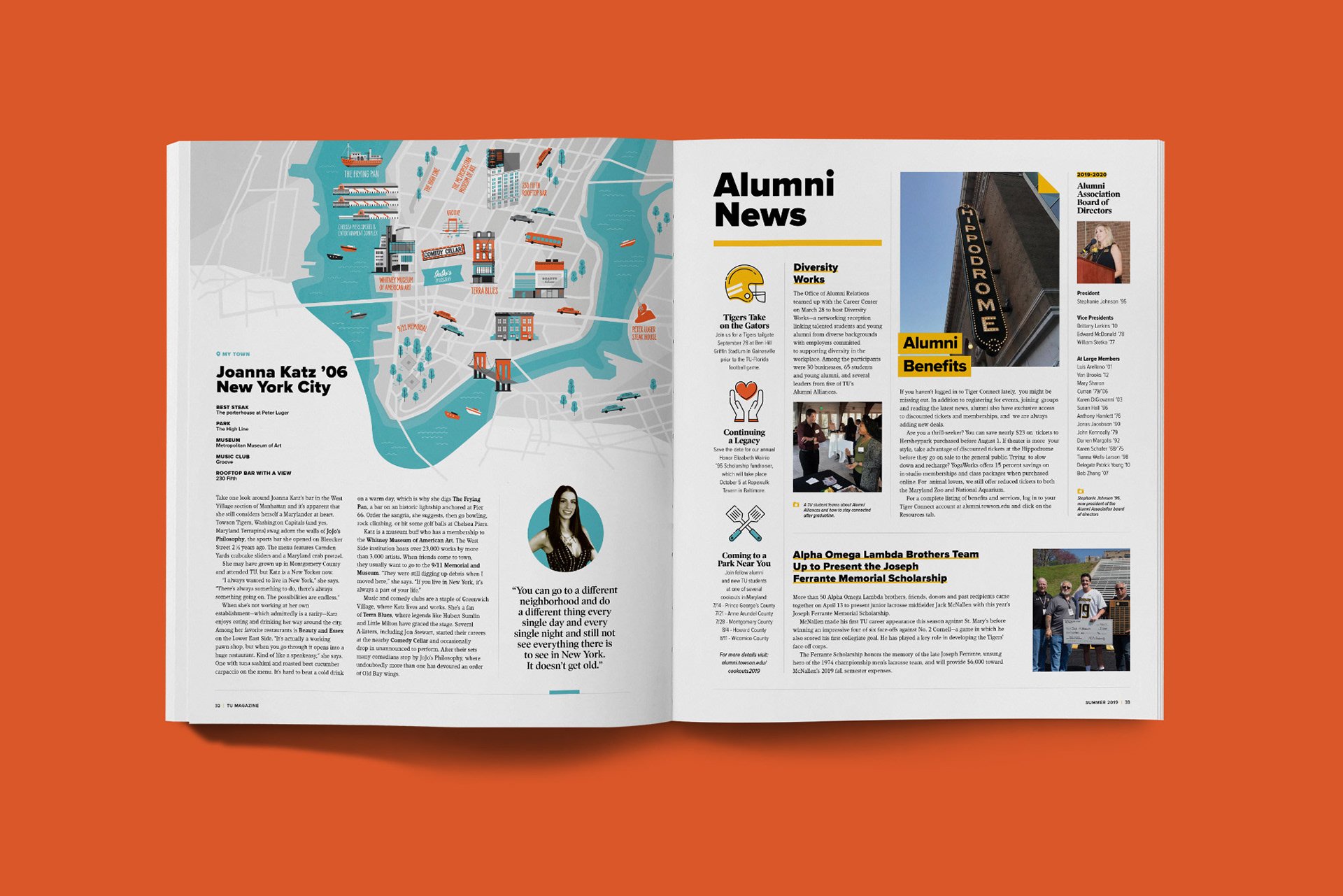
Anchor pages were built on a flexible grid that could accommodate content of different lengths in future issues. All of this was done with the intention to hand over the reigns to TU’s internal design team for future magazine issues. They have iterated on this template since this issue was released in 2019.
02 Tailored design for feature stories.
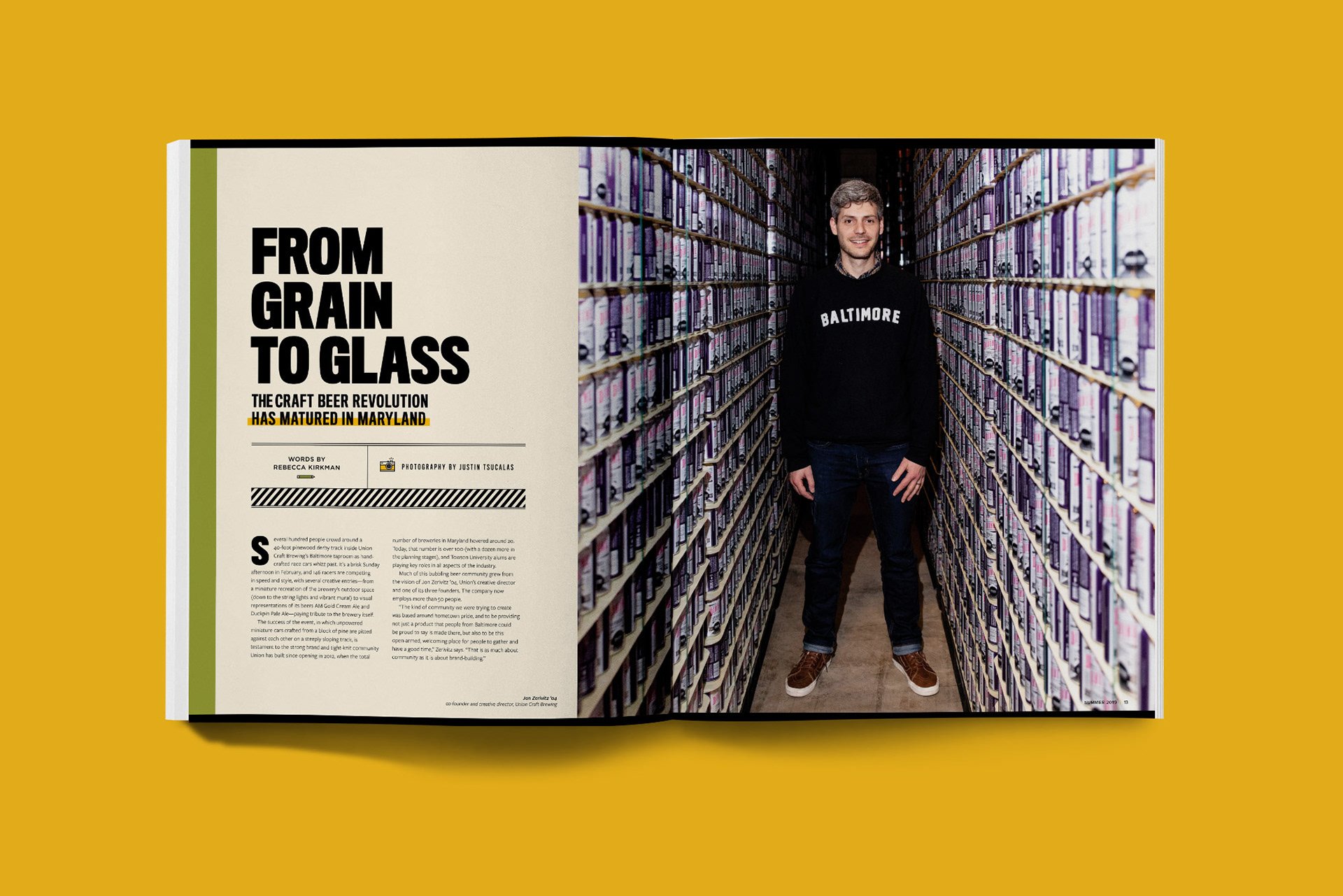
Each issue of TU magazine has a handful of feature stories. Each story is given its own personality through design, ignoring rules set by templates in the rest of the magazine.
03 Custom Illustrations
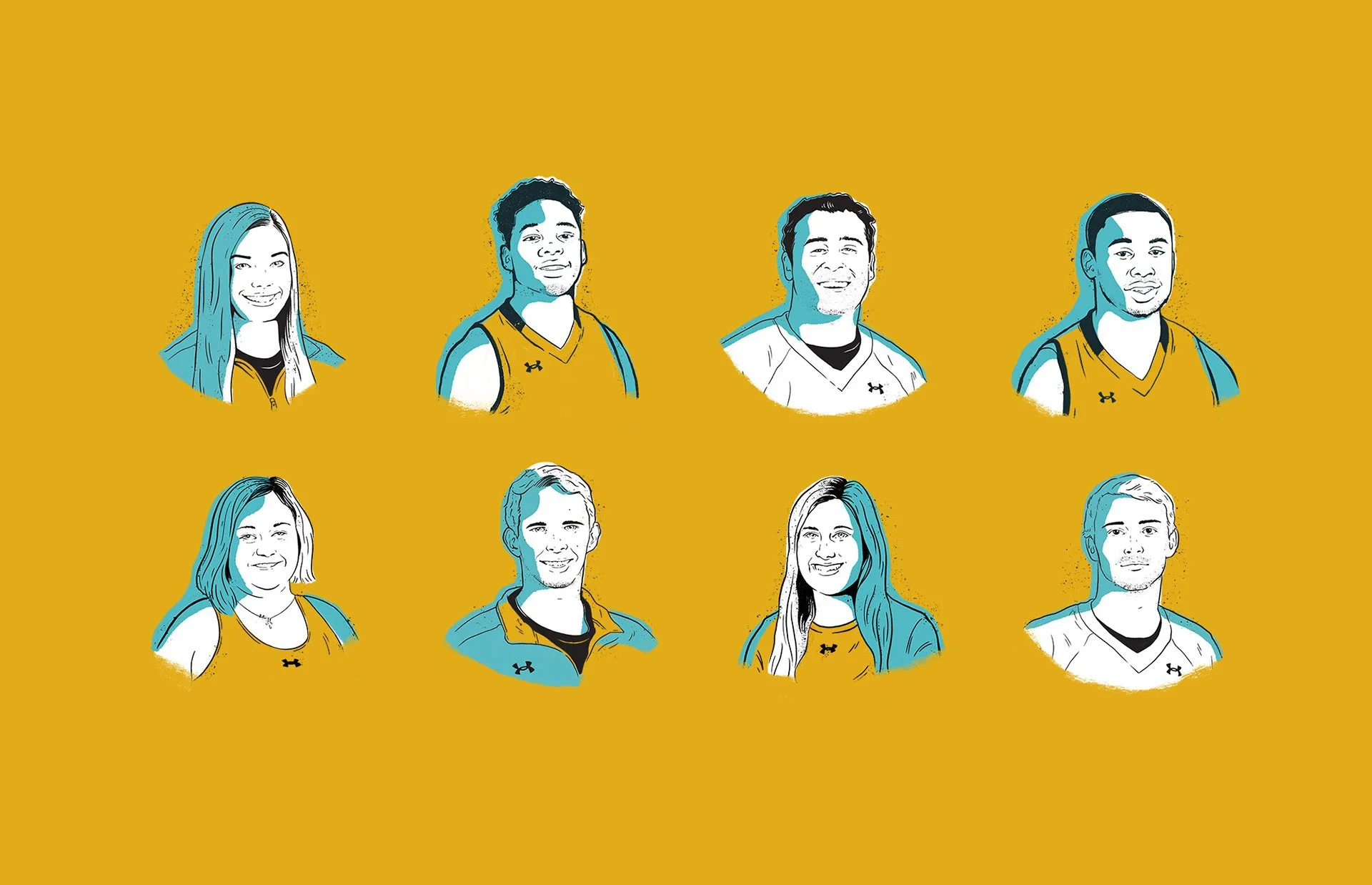
For this issue of the magazine I did all of the illustrations myself. This included editorial illustrations, infographics, portrait illustrations, feature story illustrations, and illustrated maps.
🛠️ Process
Rebuilt from the ground up.
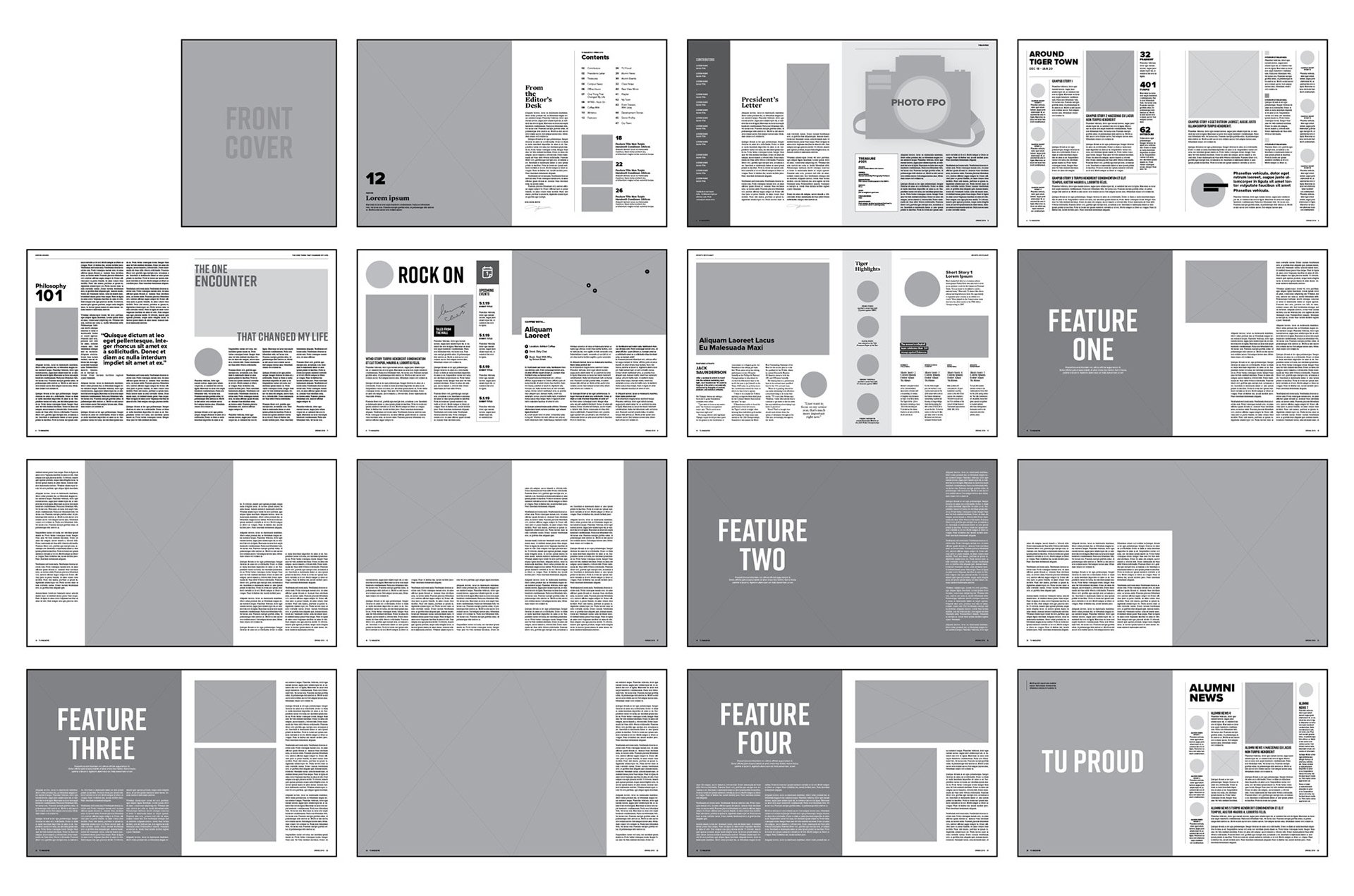
This wasn't just a redesign, it was a complete reimagining. We started by collaborating with TU's internal team to build a wireframe of the new layout. This allowed us to iterate quickly and ultimately acted as a guide to define the new sections, page size, text size, page count, and word count.
02 Style development
We developed mood boards and sample designs to determine the design direction that would be applied to the rest of the magazine. Taking these steps helped us to get buy-in from all of the decision makers before digging in to designing the full publication.
-
I would like to compliment you and your staff on the redesign of TU Magazine. I literally read it cover to cover...
ALBERT FOWLER ’68
-
The new magazine looks really great and the content was on point. Well done, congrats to all involved.
JOANN (HERBER) FOLTZ ’83
-
I received and read the latest TU Magazine. Congratulations on the redesign. The layout is great and the texture updated but the content was a marked improvement too. Great execution. Congratulations on the success.
SEAN WILLIAMS ’05

